
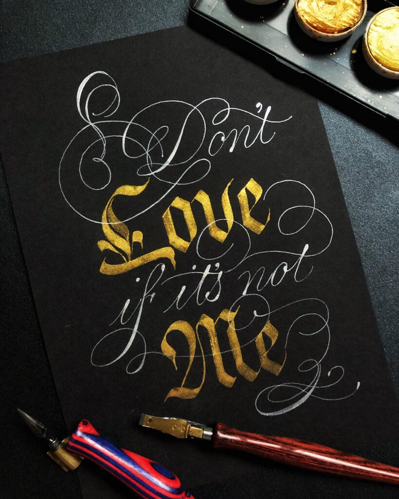
Italian Hand and Gothic Fusion

I’m calling this a script fusion, as I blended 2 wonderful scripts I learned few years ago. I love the contrast between a delicate pointed pen script against the strong and bold broad edge calligraphy.
Process involved sketching of layout, finalising layout in a piece of paper and transferring the layout in pencil before doing it up with watercolor.
Comments are closed.